

Learned #47: Logos & Uniforms, Part 2
In which we continue to learn about logos and talk about uniforms
Here's one of the more popular activities I ran while teaching ESL classes for elementary schools: I printed out a ton of 'famous' logos like McDonald's, Starbucks, Nintendo, etc. on large sheets of paper. Then, in class, I hid the pictures behind a screen and showed the kids just a small fraction at a time, making them shout out such cromulent and necessary phrases as "I see Nintendo!" and "I like coffee!" as soon as they recognized the logo.
It was a big hit. It also shows for better or worse, just how pervasive logos and corporate culture are in today's world. And I'm just adding to the chaos by trying to make my own.
Last week, we walked through some of the basic steps I went through in trying to come up with a new logo for Learned on a budget of 0 and with no formal art or design training. This week, I'll show you the progress I've made.
In this issue:
What We're Learning: The Care and Feeding of Logos
What We're Reading: The Design of Everyday Things
Down the Rabbit Hole: Back in Black, Redux
Let's get to it.
Photo by Jed Villejo on Unsplash
What We're Learning:
The Care and Feeding of Logos
By the end of last week's letter, I had pretty much decided to keep my signature color and to incorporate a typewriter as a symbol in a new logo. I also looked at the standards I needed to hit for Substack (Learned's host) and found that the software I had planned to use would not let me design to those specifics, at least not for free.
Typewriters
Stock images are all over the internet these days. I get the vast majority of my stock photos from Unsplash (where I'm also a participant) for free with optional credit given. However, when I need an actual illustration, I go to Creative Market. No particular reason other than I like how they do business and there are a lot of really creative people offering really good stock files for sale. And that turned out to be true in this case, too.

I found several different styles of typewriter, but due to the nature of the beast, the vast majority feature old-timey, classic styles. It took me a minute to decide whether I was okay with that, but after a quick return to Canva to play with some old-timey, type-written-esque fonts, I decided that I was. I ended up choosing a full set as I'd like to make a few other graphics to go along with the eventual re-boot and keep everything on the same theme.
Now comes the hard part.
Designering
As I said last week, if you have the money, hire a pro. If you need a recommendation, I know several. It's worth re-stating - I'm doing this on my own because it's a fun learning project for me, but also because I believe in paying people for their work* and since my budget is limited...

Several years ago, I bought a software package called Pixelmator which is able to function as both a surprisingly robust photo editor and as a vector graphic and illustration tool. Frankly, this project is so simple that I probably don't need anything as powerful as Pixelmator, but I'm very familiar with it and, well, I already have it.
This design project basically comes down to a few simple steps:
Create a 500px by 500px canvas
Import my typewriter design
Add in some text in my chosen font
Position everything
Add color
Delete the background, making it transparent and...
Export, job done.
Here it is, the new logo.

Well, not quite that simple. It took me several iterations and even then, the logo that got posted to Substack (which you can see in the header and also as a favicon) is different from the one here. At the small size Substack uses, adding text just made everything look awkward and unreadable, so I ended up making a much smaller, graphic only version. Which is fine. I’ll save this larger one for the reboot and continue to use the small one in the meantime.
As I said, I hope to use some of the other graphics in the package to build a few other header images and spacers to be used in Volume 2 of Learned, which will debut in a couple of months, but, in the meantime, what do you think? Love it? Hate it? Leave a comment and tell me why!
*Offering someone "exposure" or asking for a "friend discount" is insulting and belittling. Don't do it.
What We’re Reading:
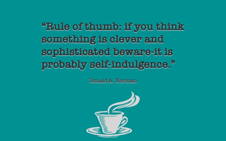
The Design of Everyday Things
by Donald A. Norman
From the Amazon page:
The Design of Everyday Things shows that good, usable design is possible. The rules are simple: make things visible, exploit natural relationships that couple function and control, and make intelligent use of constraints. The goal: guide the user effortlessly to the right action on the right control at the right time.
I’m only beginning to really get into design; this book was recommended to me by a graphic designer friend as an interesting place to begin understanding the principles behind design and how they affect us. I’m curious to see whether I’ll be able to see those same principles at work in the world around me. Either way, I’m even more curious to see how I’ll feel about it…
Elsewhere:

joeldavidneff.net | joeldavidneff at gmail | @smileytoad | @joeldneff | coffee
If you like what I’m doing and what to support this newsletter, click on the subscribe button above. The free version gets this very newsletter sent to your inbox every week. The paid subscription lets you add comments and likes to every issue.
Down the Rabbit Hole:
Back in Black, Redux
Last week, I wrote about how I’ve ended up wearing a couple of uniforms of my own devising out. As I noted then, I’m not alone. This week, I can prove it:
Lot 2046 is a subscription service that, “distributes a basic set of clothing, footwear, essential self-care products, accessories, and media content.” Why they do this, is something else entirely. From the Code of Practice -
Do not work for corporations. Old corporations were meaningful when their founders were alive, but now, they have outlived their relevancy. They exist only to keep their numbers growing
New corporations are no better. They have scaled up features, and today’s founders want hyper-growth for growth’s sake (it seems like every line of code, every feature deserves its own corporation — it sure doesn't)
I swear I can’t decide if this is a joke or not. One the one hand, it seems painfully earnest. On the other, well, this feels kind of like a weird cross between Terry Gilliam’s Brazil and Fight Club.
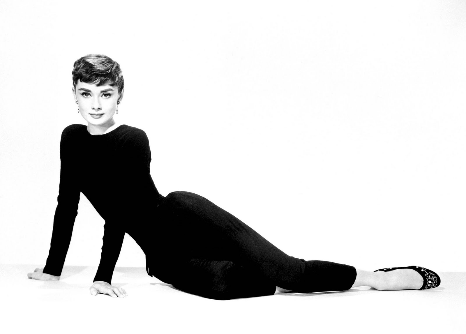
Still, Uncle Warren is a subscriber. So is Sean. I suspect Ms. Hepburn would have been one, too. It’s an intriguing idea, and, for a certain demographic, it alleviates one of the great pains-in-the-ass of life - shopping for clothes. I think if it were actually, purely black, with no visible branding at all, I would be more into it. As it is, well, it’s an intriguing idea.
That’s it. Stay strong, stay healthy. Learn something.